AI × Product Designer with 3+ years, based inCopenhagen
Hello! I’m Rumana,
AI × Product Designer.
I'm a Product designer based in Copenhagen with 3+ years of experience, across B2C and B2B enterprise SaaS platforms, using AI to streamline the process, fast and efficient.
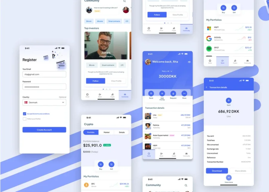
A compliance management platform for experienced professionals and organisations new to compliance, built on research with diverse personas, usability standards and a clean, intuitive UI.
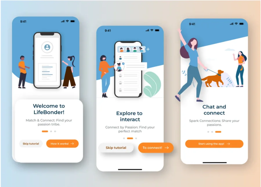
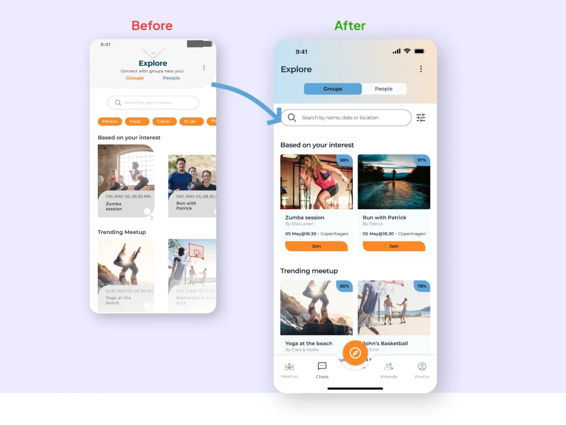
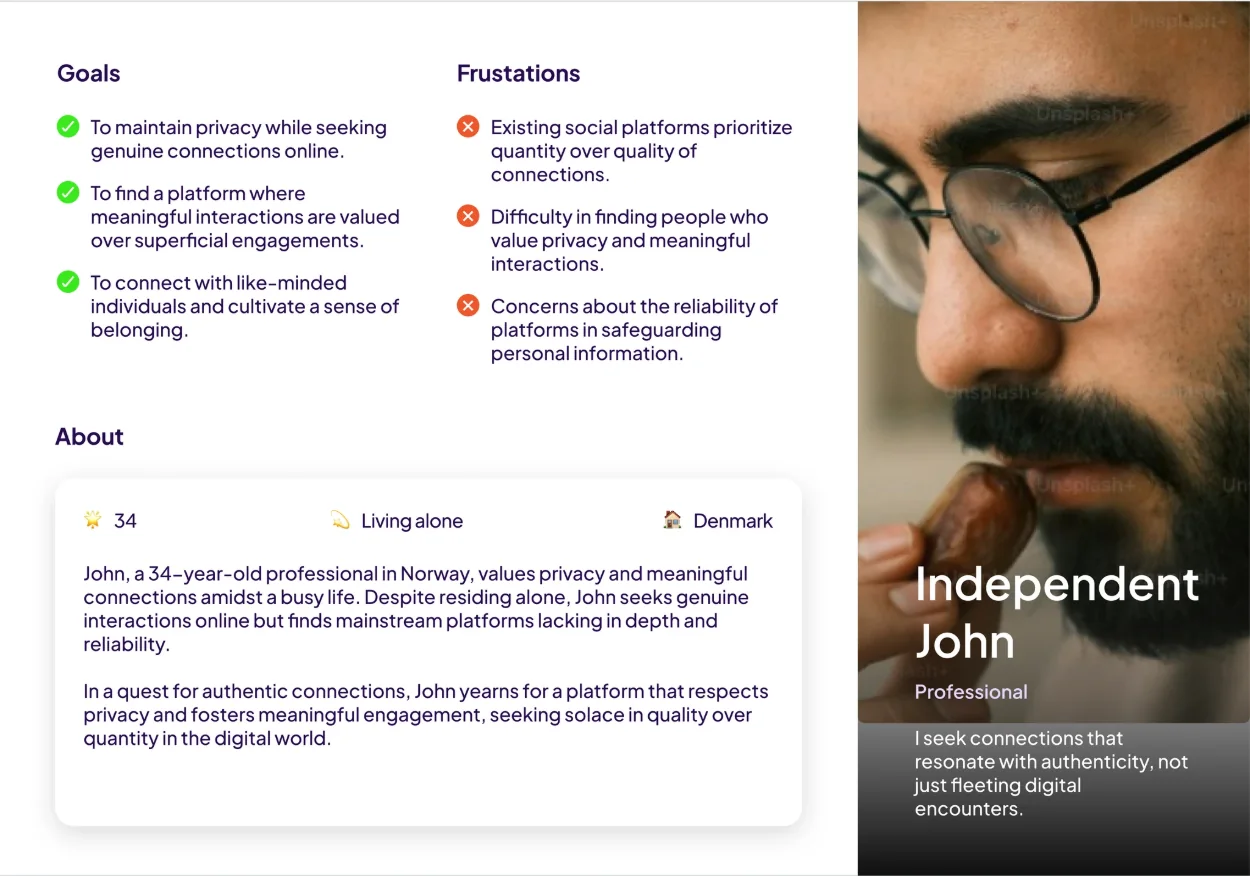
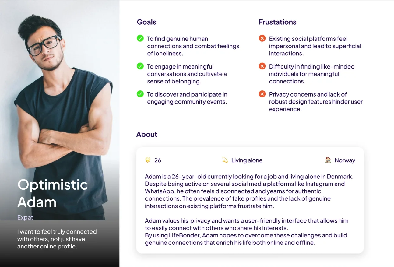
An evidence-based UI overhaul of a social networking app for meaningful connections, for people seeking meaningful connections, including expats in the Scandinavian countries.
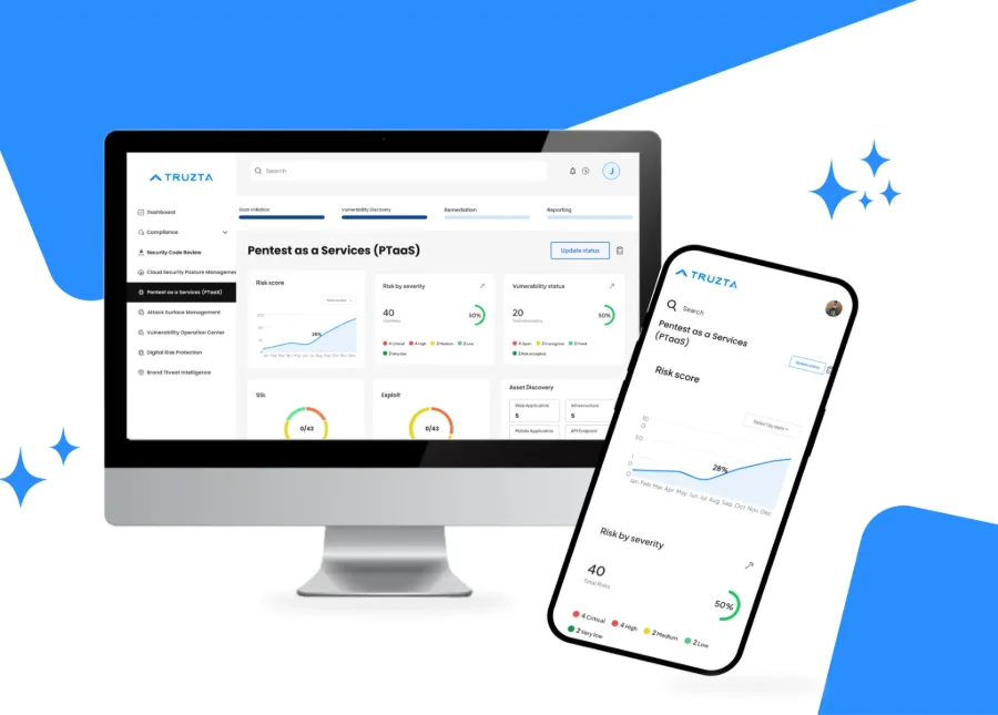
Truzta is a compliance management platform aimed at simplifying and automating regulatory workflows. The project involved user research, iterative prototyping and close collaboration with cross-functional teams.
Truzta was being developed as a comprehensive B2B cybersecurity platform comprising eight modules. The challenge was to translate complex security and compliance requirements into intuitive, consistent workflows while ensuring a cohesive user experience across the entire product.
Requirements from the product, the customer team and developers
I gathered requirements through a deep dive into the product, collaborating with the customer team and developers to gain valuable insights. This informed my design strategy, aligning it with both user needs and project goals for a seamless user experience.
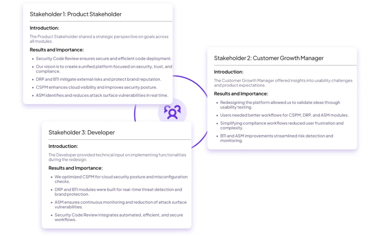
To better understand product challenges and opportunities, I conducted interviews with key stakeholders. Their inputs provided a clear direction for the redesign, highlighting areas to streamline workflows, enhance usability and align with user needs across multiple modules.
Stakeholder interviews. Product stakeholder, customer growth manager and developer.
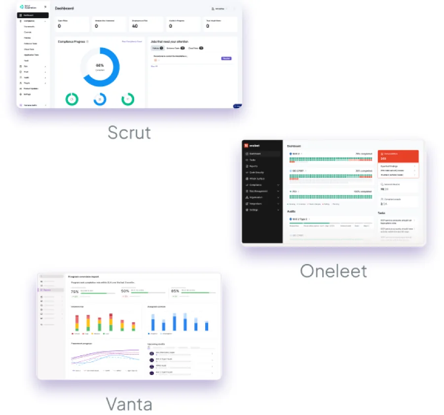
I analyzed three leading compliance and security platforms, Scrut, Vanta and Sprinto, focusing on their user experience, functionalities and customer feedback to identify common gaps and opportunities.
The biggest issues with competing products were fragmented workflows, limited framework integrations and difficulties in tracking security risks effectively. This information was leveraged to enhance Truzta's design process, ensuring a seamless experience across all compliance and security modules.
The good
All platforms provide automated compliance tracking for major frameworks like SOC 2, ISO 27001 and GDPR.
Integration with security tools and workflows streamlines evidence collection and improves team efficiency.
The bad
Limited support for multi-framework management makes aligning multiple standards challenging (Scrut, Oneleet).
Minimal focus on comprehensive security modules like CSPM, DRP, BTI and ASM leaves broader security gaps (all three competitors).
Problems from the comments
It’s difficult to manage multiple frameworks simultaneously. I end up tracking things manually.Scrut user
The risk assessment module lacks automation and requires extensive manual input.Vanta user
Onboarding was overwhelming, and I needed more guidance to understand the workflows.Oneleet user
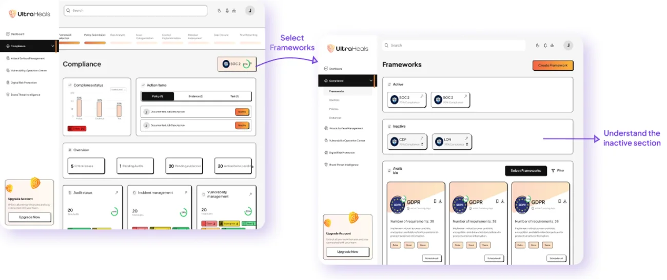
A clickable prototype, tested with the internal team
I connected my high-fidelity design into a clickable prototype. That will allow me to test the app with internal teams.
High-fidelity prototype. Select frameworks, then understand the inactive section.
Prototype validation
I validated my prototype with internal team members to test the usability of the compliance dashboard. The focus was on assessing it and selecting the frameworks, then validating whether users could clearly differentiate between active and inactive frameworks, understand their purpose and access relevant details. The testing was conducted via Zoom. Tasks included identifying inactive frameworks, understanding why they were categorized as inactive and exploring features like activating or reviewing their details.
100%found the inactive frameworks section
66%(2 of 3) struggled to understand its purpose without guidance
33%task success for interpreting its functionality
Prototype update
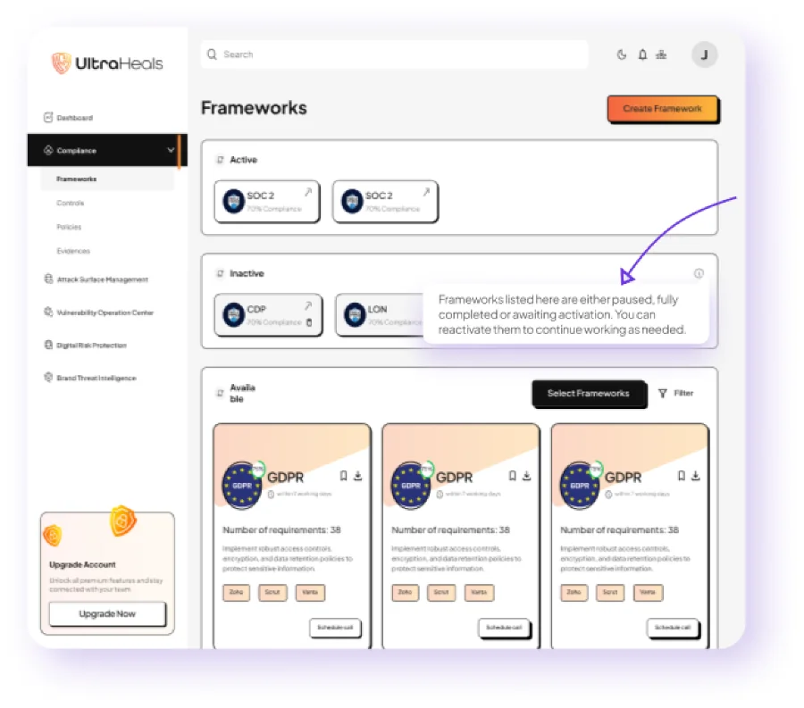
Based on the findings, I updated the prototype by adding a hover tooltip over the “Inactive frameworks” section to explain its purpose and provide actionable insights, such as steps to reactivate frameworks.
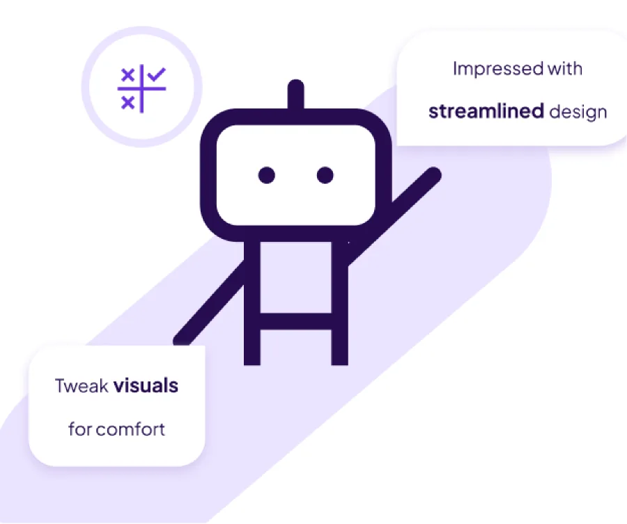
Users were impressed with the new technology and streamlined design. However, they suggested tweaking the color scheme and visuals to create a more comfortable and pleasant experience. Future iterations will incorporate these improvements to enhance overall usability and aesthetics.
Updated prototype. A tooltip explains the inactive section.
Usability testing shows
Users were impressed with the new technology and streamlined design. However, they suggested tweaking the color scheme and visuals to create a more comfortable and pleasant experience.
A redesigned system for consistency across elements
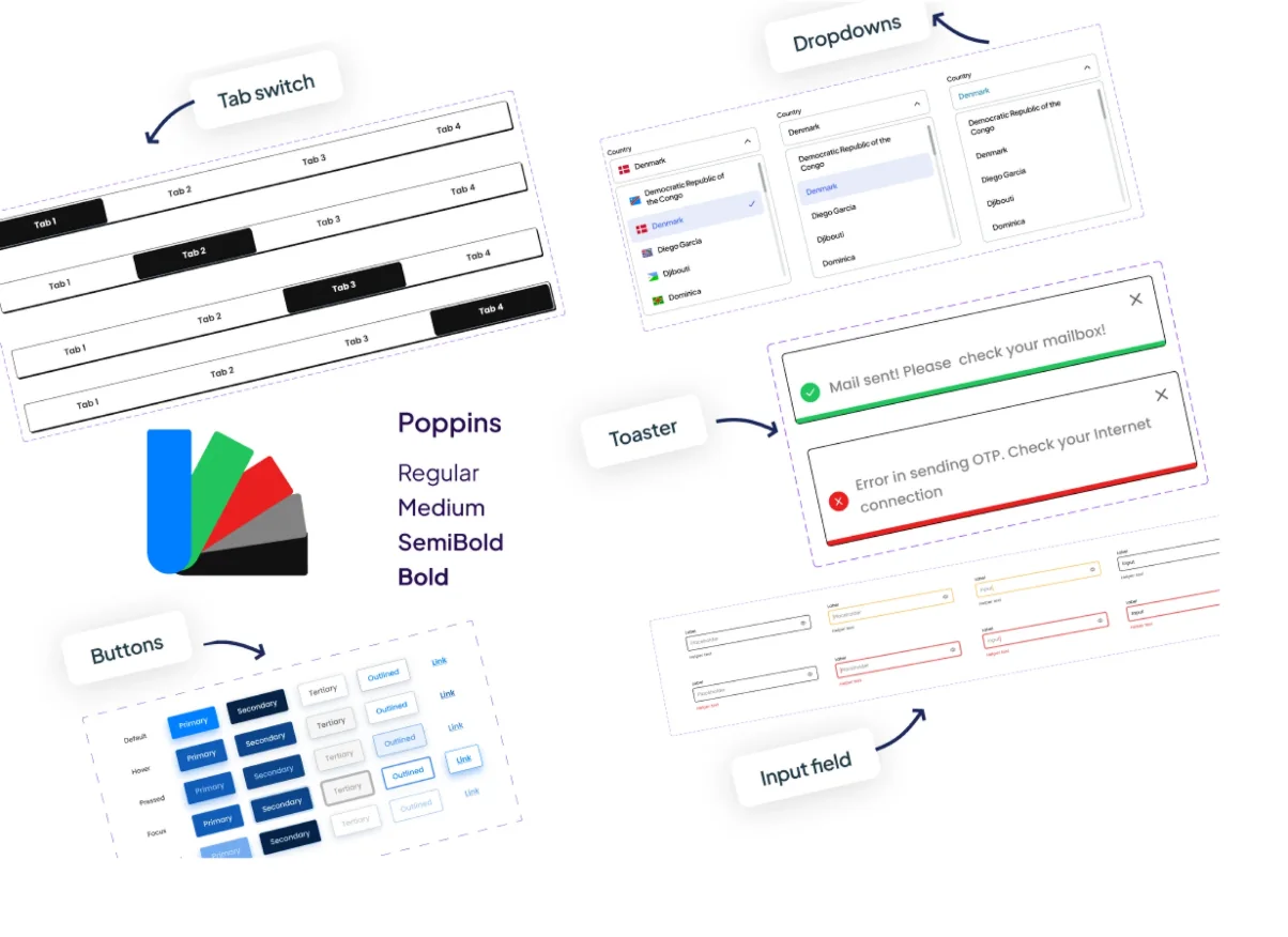
With our usability testing, we identified several issues in our UI design. To address these, I redesigned the design system to ensure consistency across elements. Below is a glimpse of the updated design system.
Updated design system. Tab switch, dropdowns, toasters, buttons, input fields and Poppins in four weights.
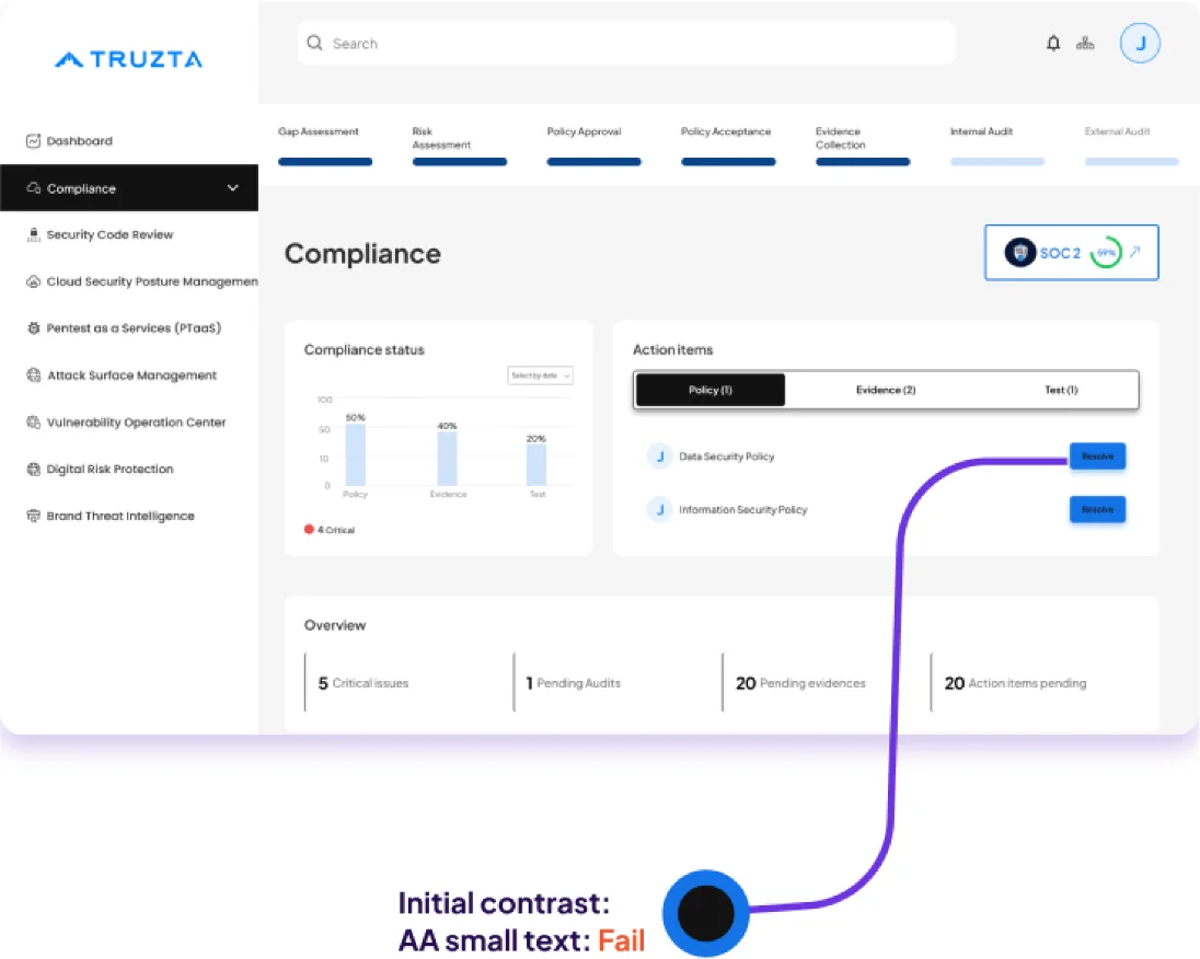
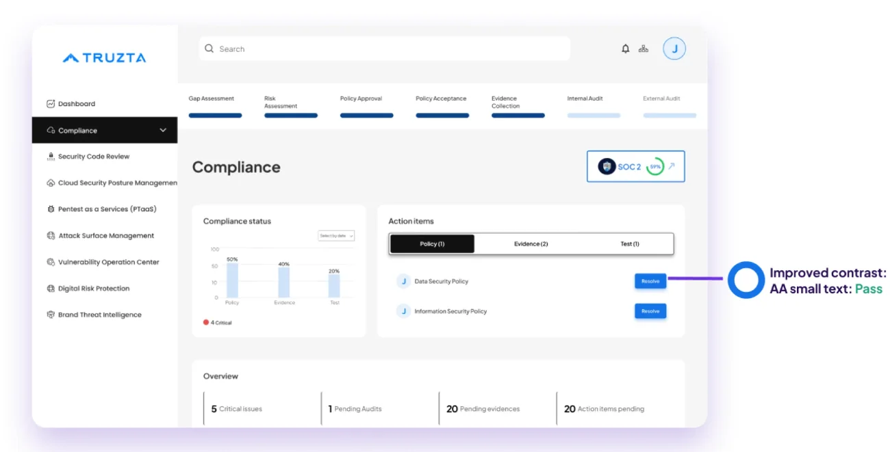
The app has been evaluated for contrast to match the AA standards of WCAG. In some cases, I found the contrast can be improved. One specific example I would like to share is the main Resolve button. My initial idea was to differentiate that button from all of the other CTAs, but the choice of color proved not to be fully accessible. In the final version, the foreground text color was modified.
A comprehensive security solution on a single platform
Challenges
Balancing the needs of technical and non-technical users.
Building the compliance module was challenging as it was new to our team, requiring extensive research and competitor analysis to get started.
Iterating designs based on technical constraints and user feedback.
Solution
Designed end-to-end workflows and intuitive interfaces across all eight Truzta modules, simplifying complex cybersecurity requirements. Established a unified design system, refined designs through usability feedback, and collaborated with developers to ship the frontend.
Results and impact
Delivered a comprehensive security solution on a single platform.
Reduced user onboarding time by 30%.
Achieved 95% task completion rate during usability testing.
8modules designed
30%less onboarding time
Next steps
Implement an AI chat feature to assist users.
Add comprehensive documentation to guide users effectively.
Scale and enhance the design system for improved usability and consistency.
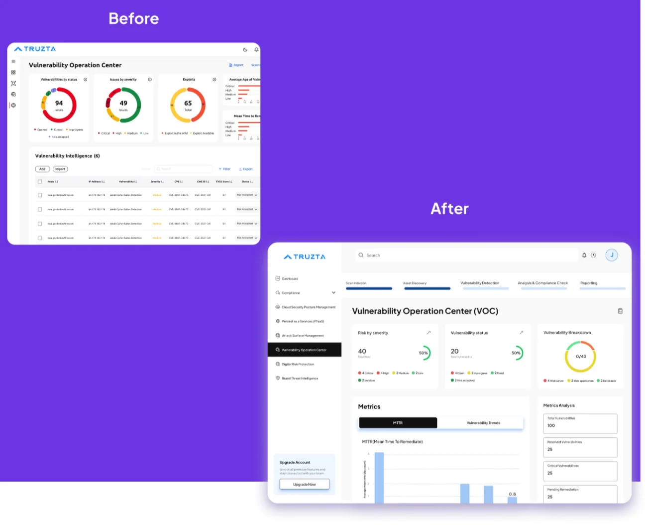
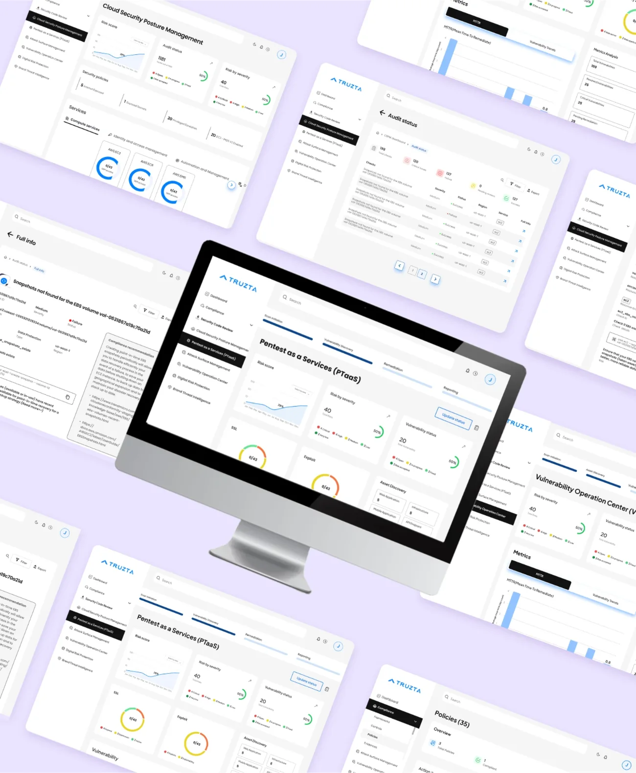
Final designs. Pentest as a Service, Vulnerability Operation Center and Policies.
I formulated the right strategy from the client’s idea, aligning design initiatives with project objectives and user needs. I conducted user research to identify pain points and preferences, and implemented accessibility standards to enhance product inclusivity and ensure compliance with WCAG guidelines.
People struggle to make authentic connections online
The claimThere is a lack of comprehensive platforms that facilitate genuine human connections and meaningful interactions in the digital age.
The problemUsers feel disconnected and unsatisfied with the app’s UI and limited functionalities, struggling to establish authentic connections and a sense of belonging within online communities.
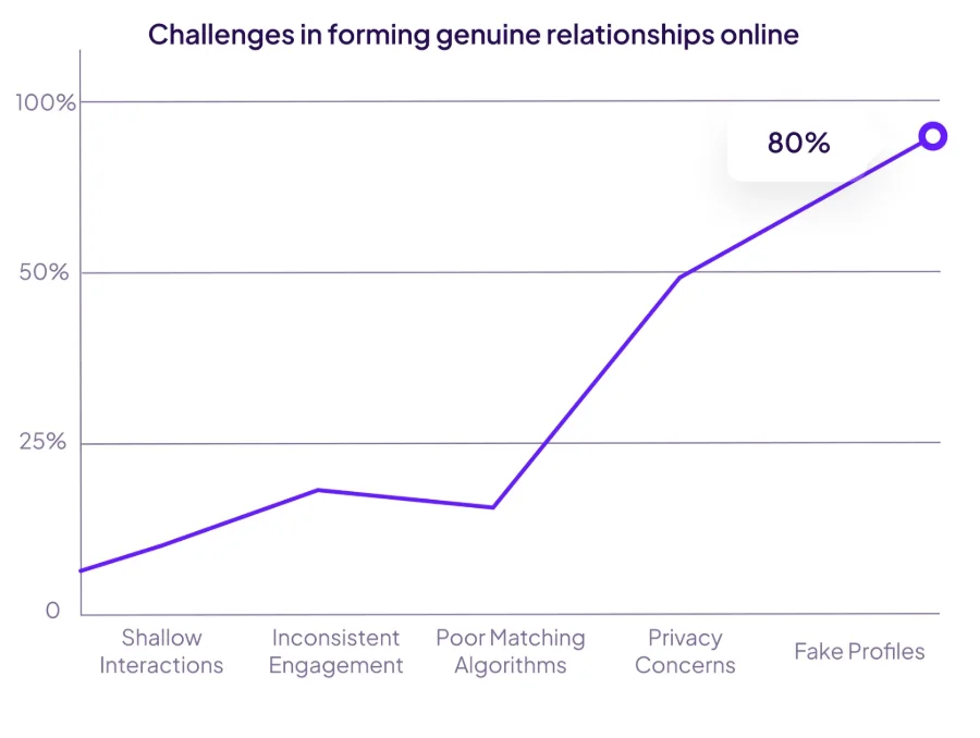
Challenges in forming genuine relationships online. Fake profiles rank highest at 80%.
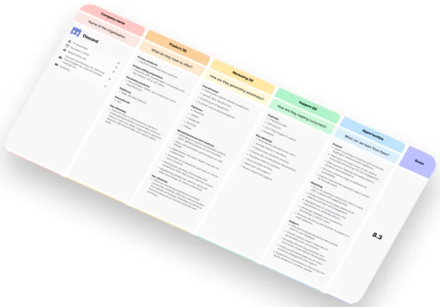
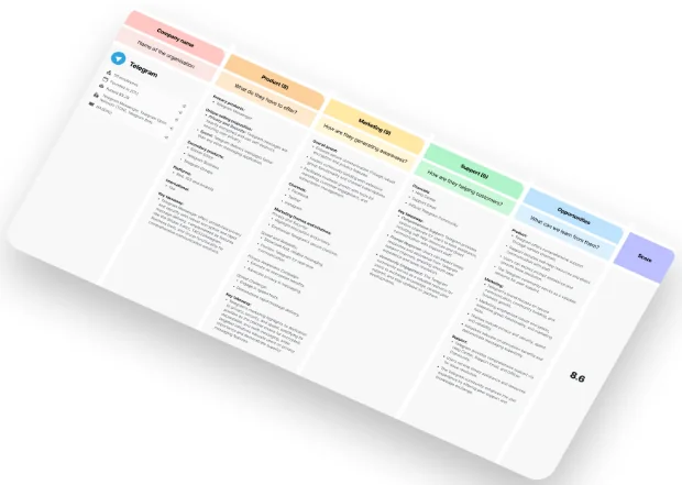
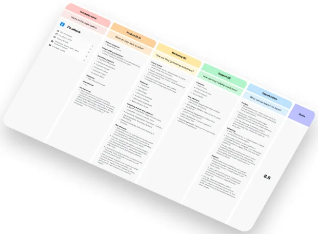
I analyzed the three most popular social networking apps focused on building meaningful connections, evaluating both the user experience and negative user comments to identify common patterns.
Facebook · 8.8
Telegram · 8.6
Discord · 8.3
The goodAll platforms offer robust communication and networking features to build communities.
The bad
Ineffective verification of user profiles leads to issues with fake accounts (Discord and Telegram).
Limited support for organizing and promoting local events (Telegram and Facebook).
Algorithms often promote shallow interactions over genuine connections (Discord and Telegram).
Problems from the analysis
I can’t browse profiles before creating an account, no idea if it’s worth it!Madona
Too many fake accounts ruin the experience, it’s hard to know who is real.Michael
There’s no good way to promote local events to users nearby.Lee
The app keeps suggesting irrelevant events that I’m not interested in.Ria
I find it difficult to connect with like-minded people for meaningful conversations.Lina
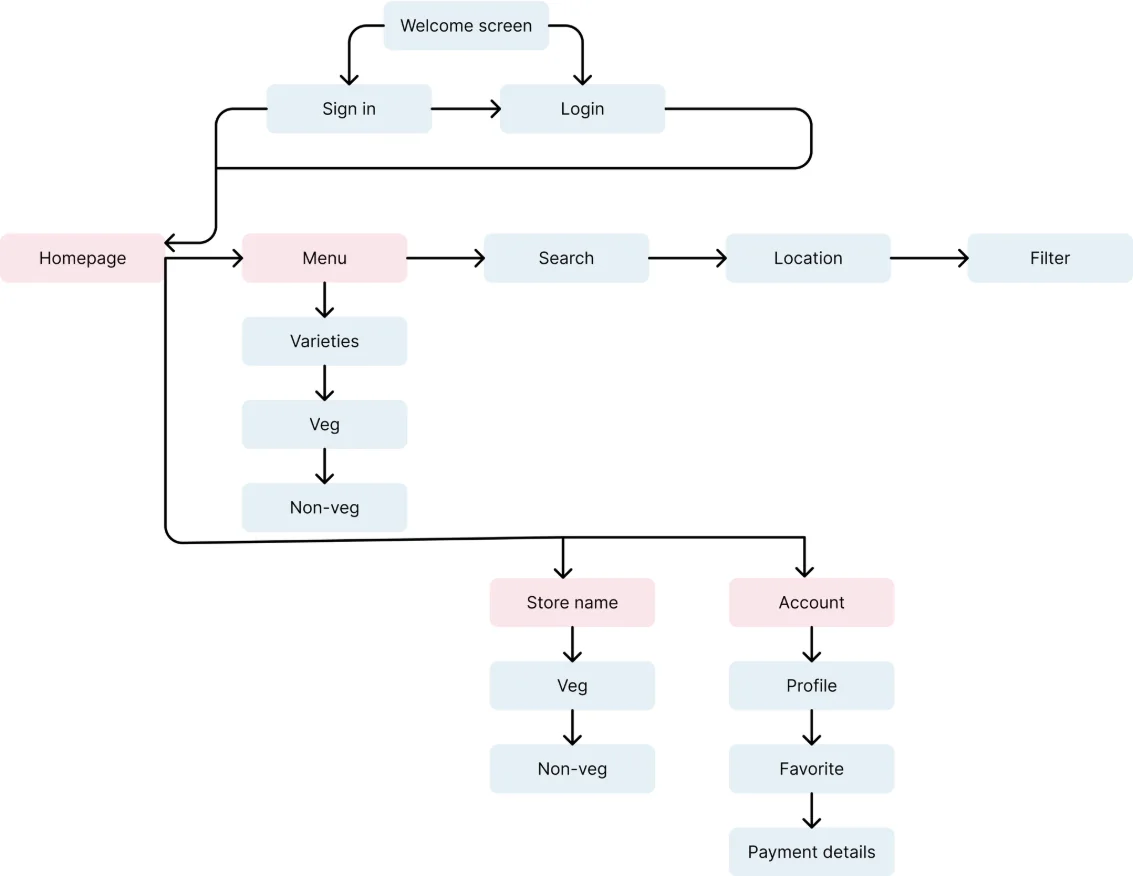
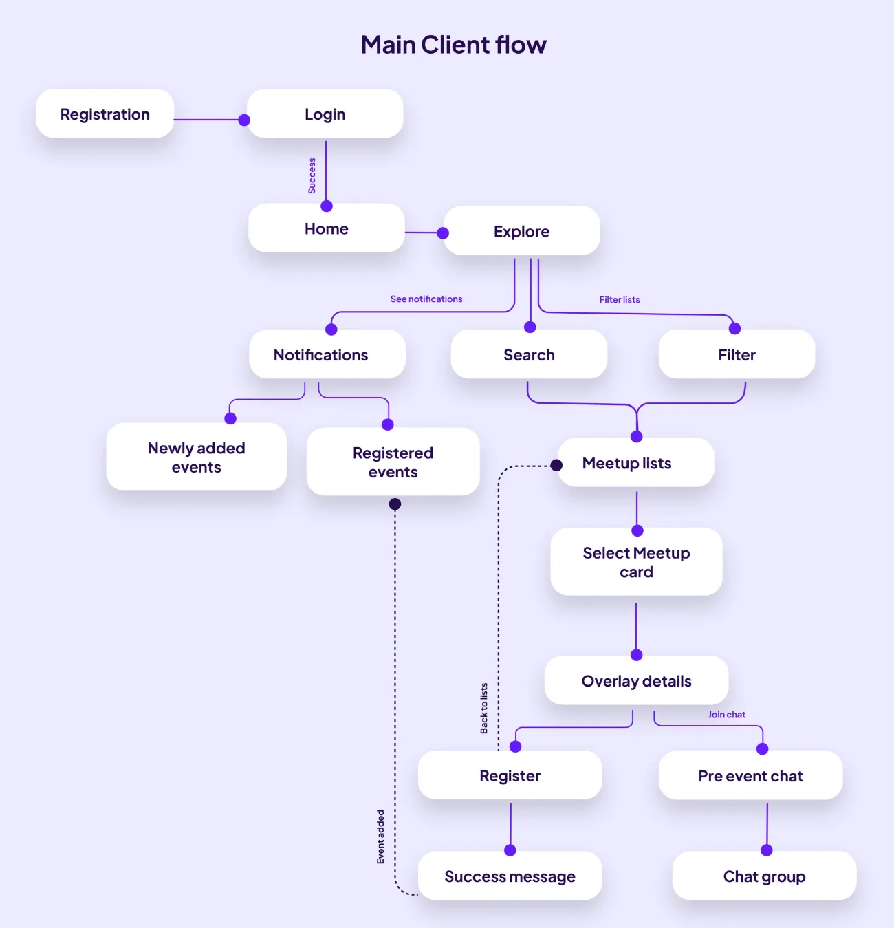
To outline all the necessary functionality, I created a simple flow diagram of the main tasks the user can do. One of the flows is shown below. Fail-state flows were also created, but are not shown due to space constraints.
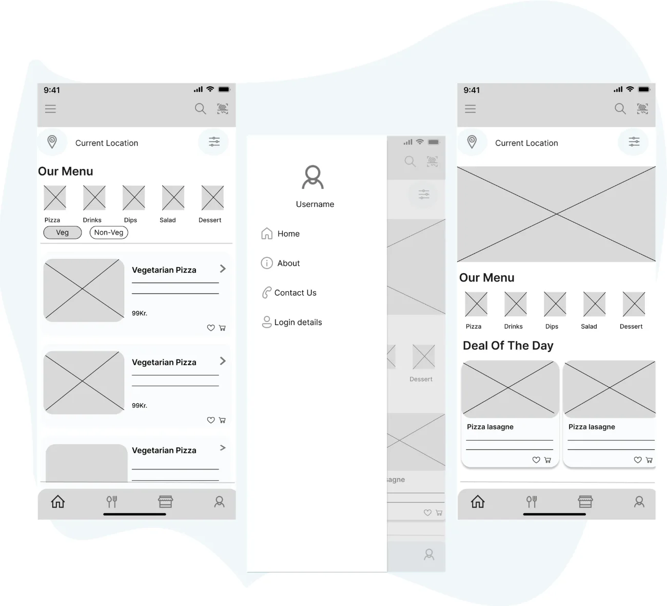
Once the flow diagram was established, I started creating the low-fidelity wireframes of the main flows.
Once the initial flow was complete, I started by creating a couple of the main screens of the app, starting with the fonts and colours.
Font · Montserrat
RegularFind your passion tribe
MediumFind your passion tribe
BoldFind your passion tribe
Genuine connections look and feel
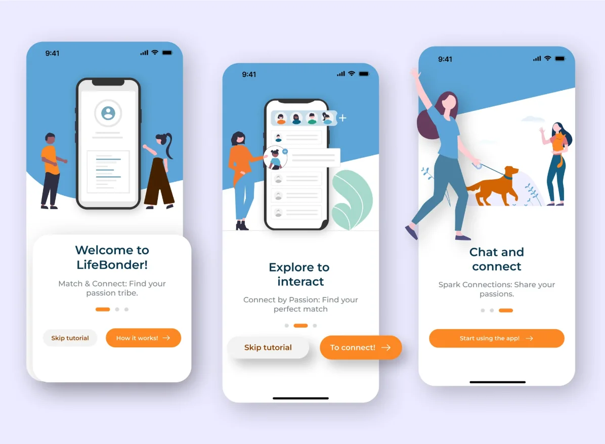
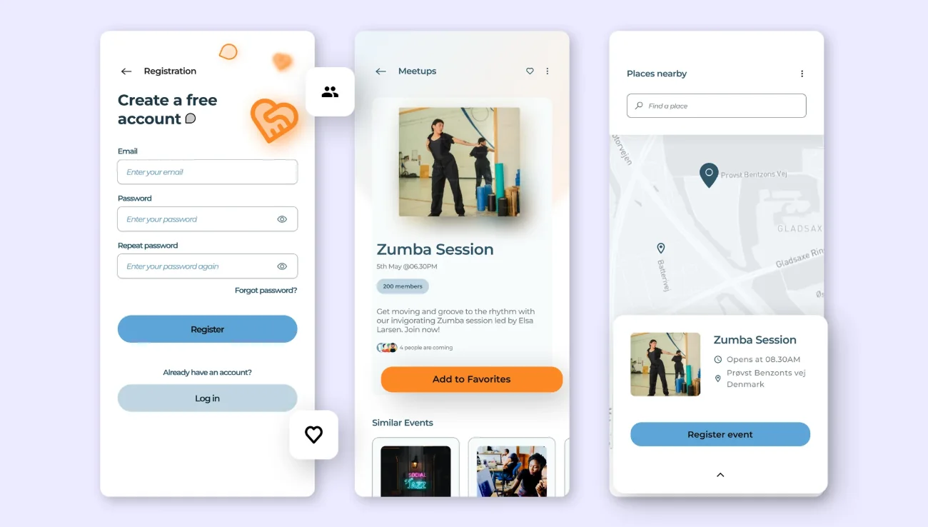
The style was achieved by using friendly, welcoming illustrations of people, conversation bubbles and community icons.
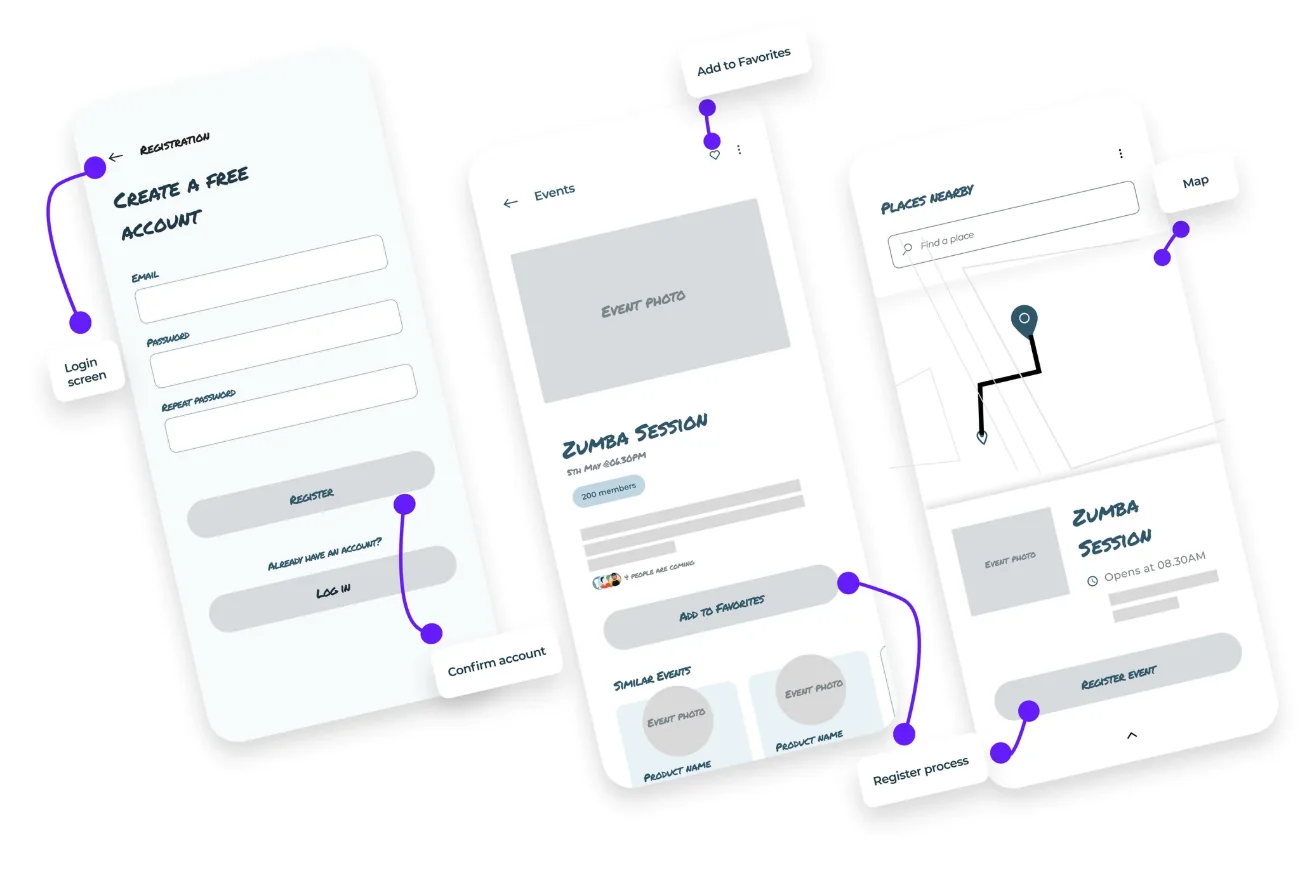
High-fidelity UI. Registration, meetup details and places nearby.
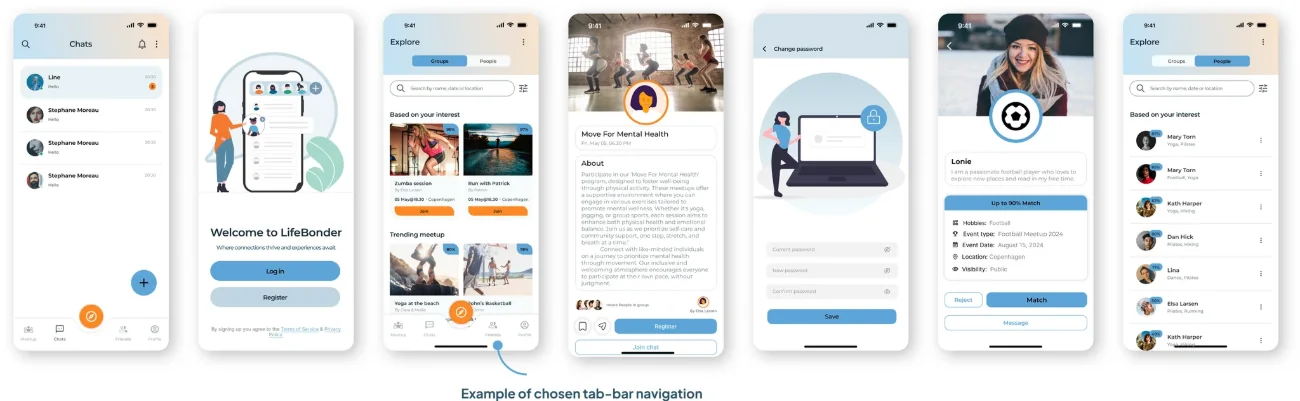
50 designs, two navigation patterns
50 high-fidelity designs were created, including two different navigation patterns (a tab bar and a hamburger menu) that could be used for A/B testing in further design stages. I tested simple white backgrounds on main screens and a version with gradient backgrounds to evoke a warm and inviting feel, enhancing the sense of community and connection.
I validated my prototype with 3 users. Each was given a subset of the prototype dedicated to exploring interest-based chat groups. I wanted to ensure users understood how to find and join these chat groups and that each group had a dedicated page for interactions. This was tested over a Zoom call, where I introduced the user to the app and asked questions focused on the ease of navigating to and within the interest-based chat groups.
66%(2 of 3) were unsure what to do from the explore groups page
33%task success rate
Study results
Users quickly understood how to join a chat group but did not expect additional information to be accessed by tapping the group image.
Prototype update
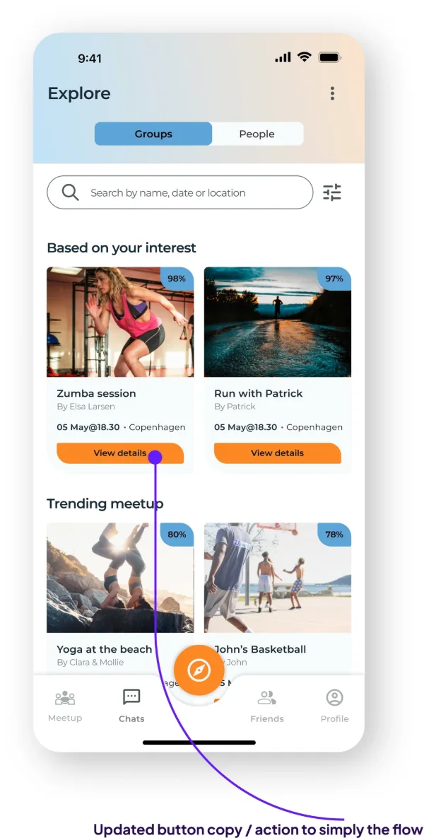
Due to time constraints, I wasn’t able to run a second usability study on the updated prototype. However, I updated it by moving the “Join” button to the group details page and replacing it with a “View details” button on the explore groups page.
Updated prototype. View details replaces Join on the explore page.
Faced with limited resources, including a shortage of developers and funding, which delayed the full implementation of all proposed design changes.
Solution
Developed a fresh, user-friendly and accessible interface. Recommended new functionalities and presented these improvements through detailed mockups and prototypes.
Results and impact
The partial implementation of the redesigned UI led to a 40% increase in user engagement, positive feedback and improved accessibility. The redesign ensured compliance with WCAG guidelines, enhancing inclusivity for all users.
40%increase in user engagement
50high-fidelity designs
Next steps
Continue refining the UI based on ongoing user feedback.
Fully implement all proposed changes.
Maintain adherence to accessibility standards to further enhance the platform's usability and inclusivity.
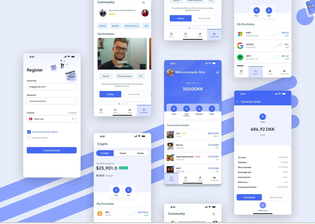
I turned my passion for design systems into action, addressing the widespread inconsistencies and documentation gaps I had seen in previous experiences, which are crucial for startups navigating high intern turnover. A robust design system ensures scalability and cohesion, elevating the user experience across platforms.
Inconsistent design and poor documentation posed significant challenges, made worse by frequent intern turnover in startups. This hindered scalability, consistency and user experience, and called for a structured design approach.
My strategy focused on comprehensive research into user preferences and industry standards. This informed the development of a modular design system tailored to the needs of a scalable and consistent application.
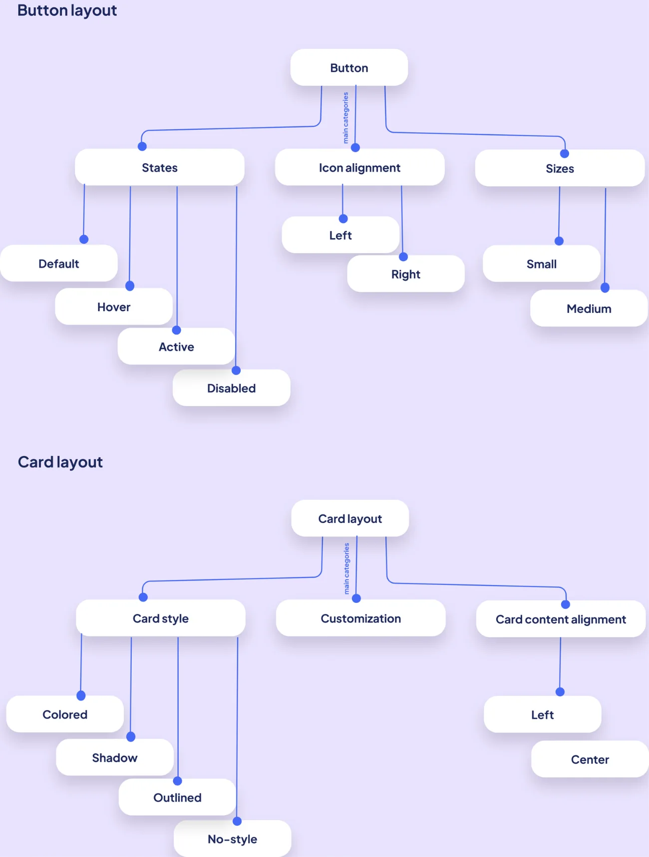
To outline all the necessary functionality, I created a simple flow diagram of the main tasks the user can do, including fail-state flows. Complex components were then broken down into their parts and options.
Complex component breakdown. Button and card layouts.
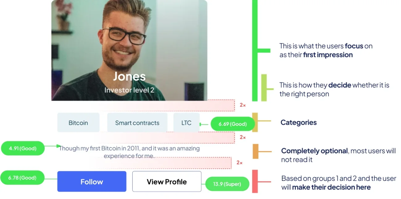
The idea behind this decision is that the description is the least useful part for most users, as they mostly focus on the name, title and tags or categories to make their choice. We added a clear separation to enforce that division clearly and form logical groups.
Investor card. Groups 1 and 2 decide; the description is optional.
Working alone, I faced the challenge of balancing comprehensive research with design implementation. Additionally, integrating the design system into a hypothetical workflow required anticipating potential stakeholder expectations and ensuring the system was flexible enough for real-world applications.
Real-world experienceLacking collaboration
Results and impact
Though not implemented in a live environment, the project demonstrated a measurable improvement in UI consistency and efficiency through theoretical application and testing. Design iteration time was reduced by 40%, and feedback from design peers indicated a significant enhancement in usability and visual appeal.
40%less design iteration time
7colour roles
Next steps
Expand the design system to encompass additional application modules.
Conduct more comprehensive user testing.
Potentially collaborate with companies to implement the system in real-world scenarios for further refinement and validation.
Making uncluttered textClutter in the text doesn’t just mean extra or unnecessary stuff. Clutter is also stuff out of place and stuff that doesn’t fit right. Keeping too much stuff sometimes makes the text cluttered. Through the design process, we came to know the important text to keep on the page.
A delightful, consistent customer experienceTo ensure a proper design system is in place to reduce technical debt, and give our customers a better, consistent experience through navigation.
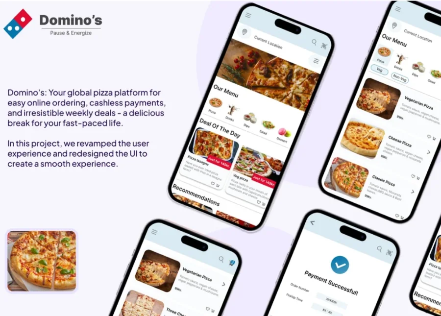
Strengthen the value proposition of our core productsWith new products introduced, we want to highlight our core product offerings that go beyond deals. We aim to allow a habit-building product for our customers while strengthening product discovery on the website.
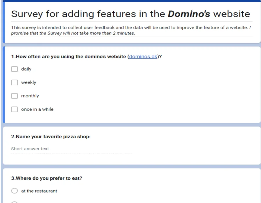
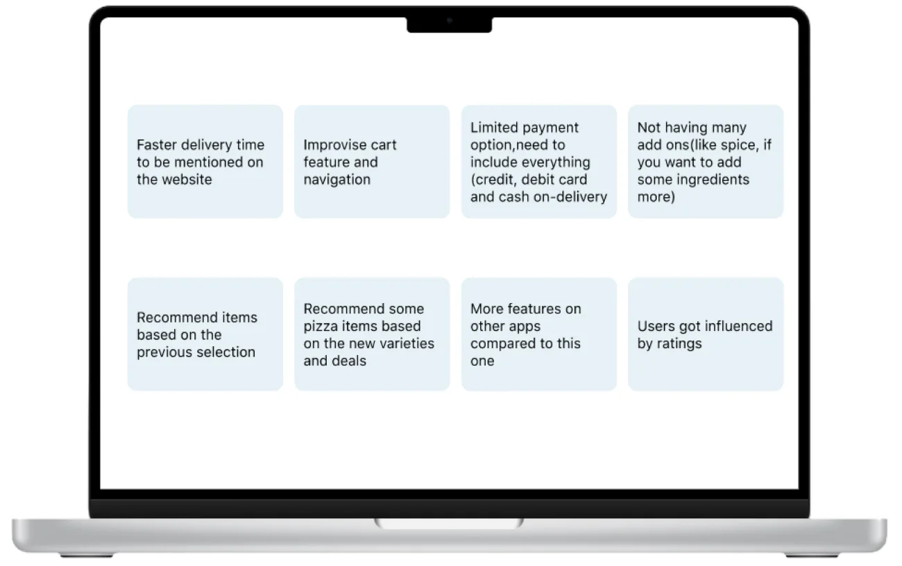
After conducting an online survey with 10 respondents, primarily working men and women aged 20 to 35, the following findings were identified to improve the website:
Enhance the cart feature and navigation for a smoother user experience.
Clearly display the expected delivery time on the website to set appropriate customer expectations.
Target faster delivery options to cater to the preferences of the young, time-conscious audience.
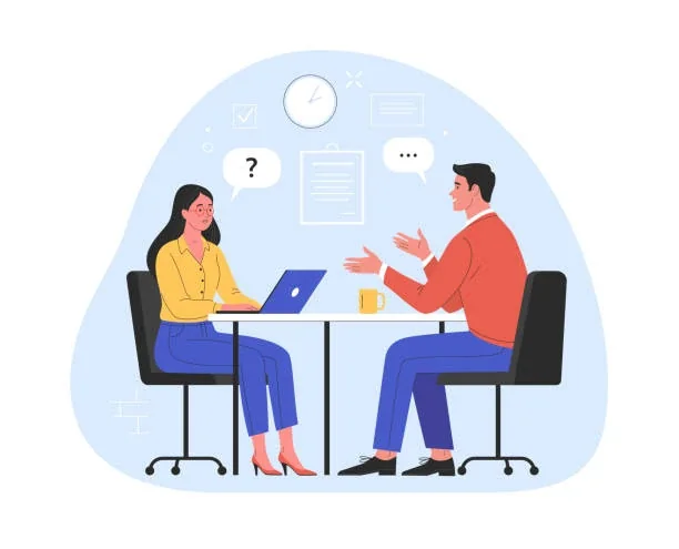
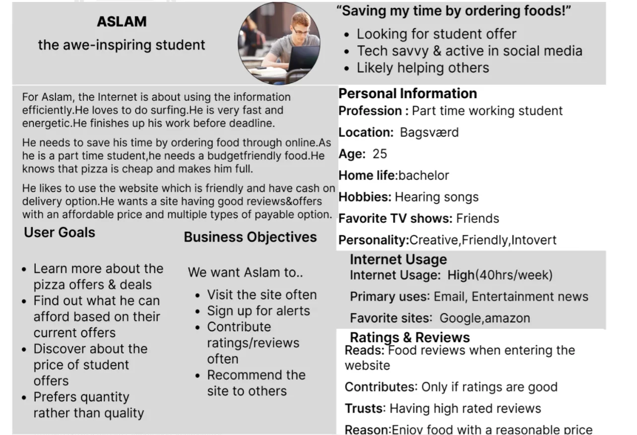
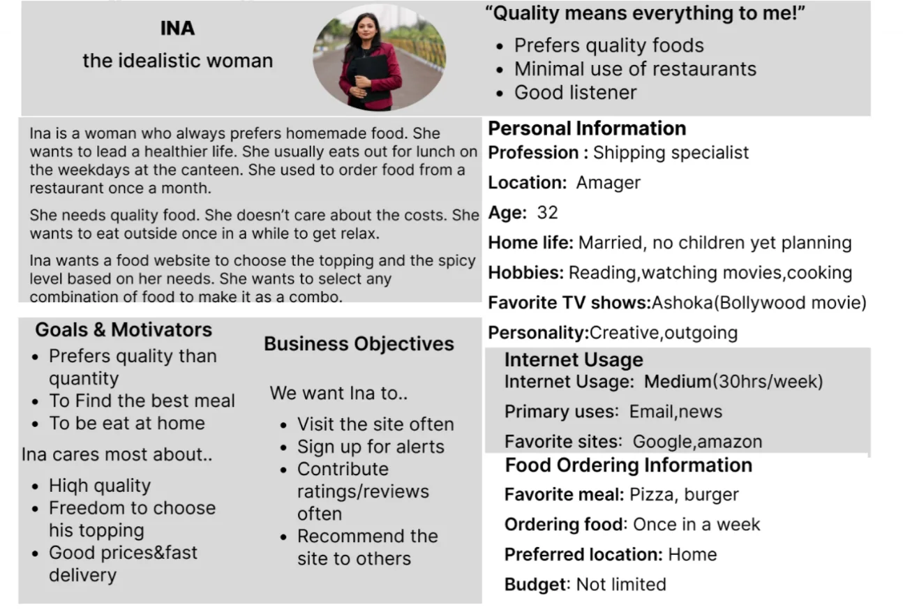
During the ideation phase of the project, I conducted user interviews to build new personas and to inform the design. I interviewed two people to validate my hypotheses.
Research goals
To understand how people are using the features.
To understand what kind of websites or apps they use for ordering food.
Uncover the biggest pain points while using Domino’s website.
Uncover expectations while using Domino’s website.
Information architecture that matches expectations
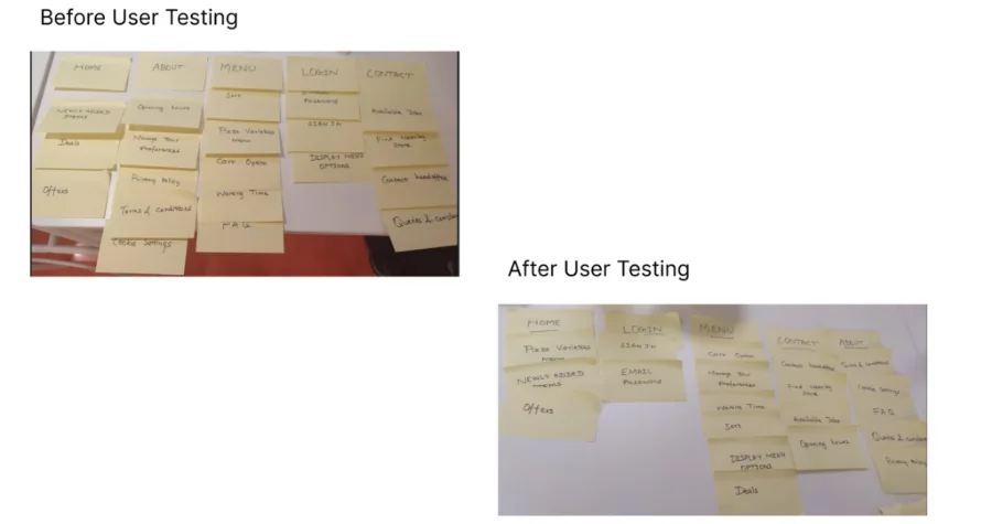
To make sure that the site’s information architecture is aligned with user expectations, I ran card-sorting sessions with 2 users. My goal was to focus on the persona user group to list the 5 major categories with their sub-lists.
To validate the designs and test the prototype, we ran usability testing with real users: 4 people in the first round, and 2 people after iterating on the issues we had identified.
More interaction pagesThere were more interaction flows, which made ordering food take even longer. Users seemed a bit exhausted during the test.
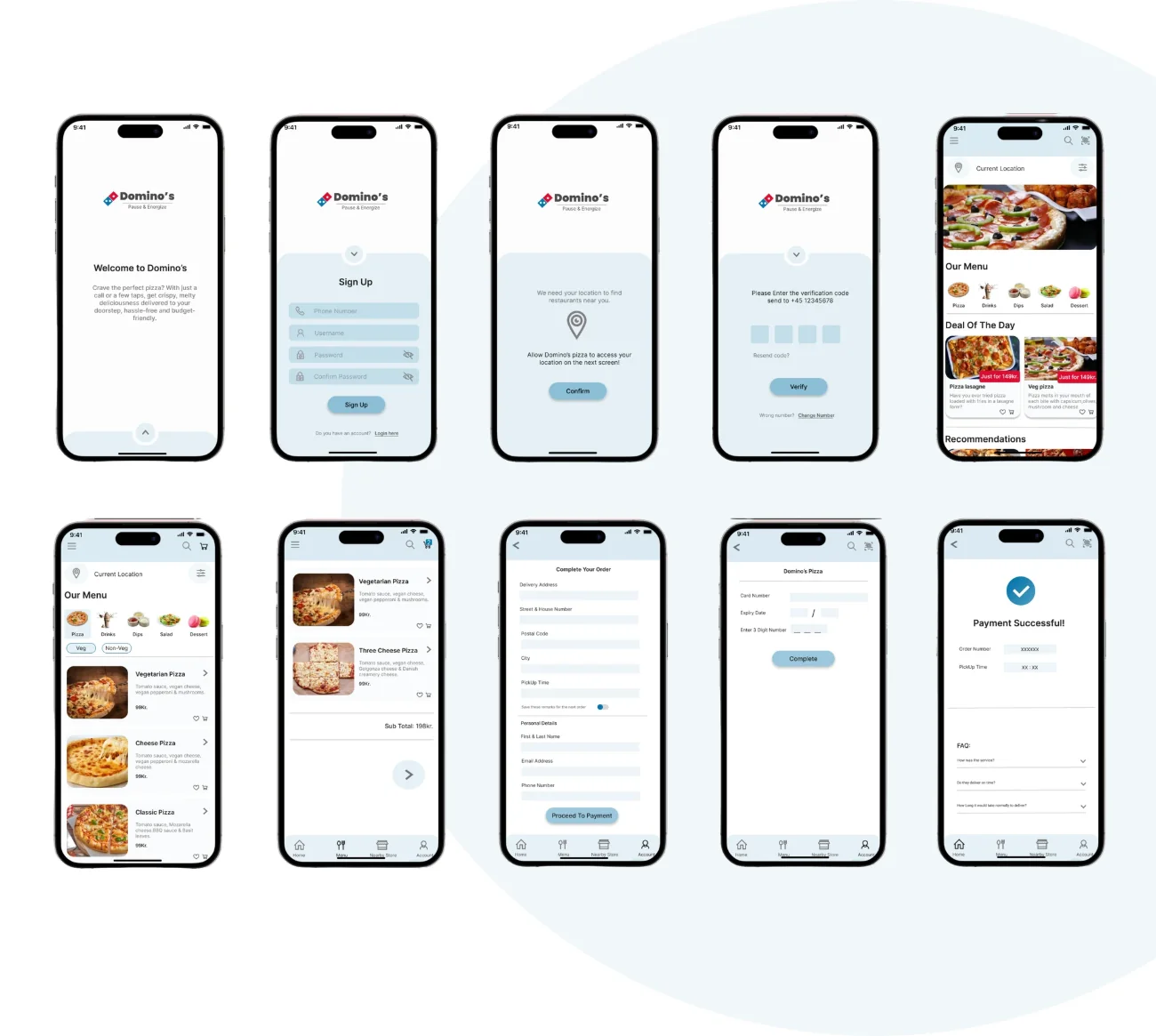
SolutionI reduced interaction so users can order in minimal time. I iterated the design once and validated it with the “thinking aloud” method.
Low-hanging fruitsUsers pointed out low-hanging fruits: display all menus on the same page with a scroll-down menu, and place a button on the home page to place an order and to get back to the home page.
SolutionI noted them and worked on the main findings first. Finally, I fixed those low-hanging fruits and redesigned for a better experience.